Education has become a very competitive business today. The total worth of the education technology sector globally was valued at 123.40 billion USD in 2022.
This only proves that every company in the education sector is trying its best to make a name for itself.
If you plan to expand your education-related company, you must set up a brand logo first.
A logo makes your company recognizable and also helps to promote it. So if you wish to design an impeccable logo, here are some tips and tricks!
1. Know the brand first
Before you even start to work on an education logo maker of your choice, it’s important to know more about your brand.
Remember the most important things you’d want your customers to know.
Are you managing a coaching center for high-school students? Or does your company deal with educational book publishing?
Depending on the main products or services, you’ll have to keep the logo related to that.
If you’re making a logo for another client and you don’t know anything about their business, you should ask them to give you more details.
2. Take inspiration from others

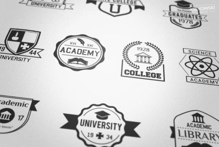
Even though you’re not ethically allowed to simply copy-paste another brand’s logo and pass it off as your own, there’s no harm in taking a bit of inspiration from similar companies.
Check out what others in your competitive area are doing, and then figure out ways to make your logo stand out among them.
You’ll be surprised at how many unique ideas you come up with!
For example, if you see a rival company using a cartoon of a book on its logo, you can try to find ways to make a book and a pen work together on your brand’s logo.
3. Check the credibility of the logo maker
If creating an education logo has been assigned to a different firm or artist, it’s important to ensure that this organization or person is credible.
You don’t want to waste a ton of money and then end up with a logo that looks sloppy, right?
So, if you have approached them, ask them to show you their portfolio or examples of their previous projects.
Many companies will already have some examples on their website, but some others don’t publish them openly for security reasons.
In this case, ask them how they designed these logos and which software they used.
4. Make it unique
When it comes to actually making the logo, you have to use a logo maker that prints out unique and memorable ones.
You won’t get a competitive edge if your logo looks similar to hundreds of other education companies.
The first thing you need to remember is not to choose the color scheme others are using.
Most education companies use palettes like white and sky-blue or white and red.
Instead, you can go for pastel colors like beige and orange. Then, use 3D effects on your logo to make your company stand out.
5. Think about the long-term use

Designing a good logo isn’t enough because you have to think of its long-term use too.
For example, if your company manufactures educational tablets for schools today, it might expand and start manufacturing projectors in a few years.
So you never know how big or small your company can become later. Therefore, choose a logo that will be timeless and open to change.
Since every item produced in your company will have the same logo, you have to think of something that applies to all the products and services involved.
6. Select fonts and colors carefully
If you carefully select the color scheme of your logos, it can negatively impact the viewers.
Using too bright colors, such as neon green or pink, won’t look good. Similarly, don’t go for color palettes that look haphazard together, such as bright red with forest green.
When it comes to the fonts, too, make sure the font style is simple and legible. In the education industry, logo fonts must always be bold and striking.
And if your company’s brand name is the logo itself, you must be extra careful while choosing it.
7. Use the white space properly
White space is a design concept that helps the elements of the logo to stand out. It is the space left out intentionally to make the elements of your logo clear to the audience.
For example, in the FedEx logo, there is a little space between the ‘E’ and the “x,” which makes it look like an arrow, hence implying its fast services.
Similarly, you can cleverly use white space to create the impression of a school bag or books.
Using white space properly will make the design look minimal and clean and impress your potential customers.
8. Balance all the elements

After choosing the font and the colors for your logo, you need to check if they look well together.
Perhaps they look great separately, but things just seem bland when you merge the font on top of the background.
So it’s necessary to balance out all the elements involved in your logo.
Or, if you’re planning to insert the company name within an icon in the logo, place it in a way that it doesn’t look disproportionate.
Even if you’re not able to do it on the first try, don’t give up. Repeating the process several times will help you become a pro!
9. Get feedback from others
Now that your logo is complete, you should receive honest feedback from others in your company before rolling it out publicly.
Feedback will help you recognize any flaws in the design or if it can be improved in certain aspects.
Remember, your personal opinion is important, but it’s always better to get the entire group’s consent first.
After gaining their approval, you can roll out a beta version of the logo to a select few in public and see their reaction. Then, run a poll on social media to see which design is a fan favorite.
Over to you…
Even though designing an educational logo is quite simple, you have to take care of some things. However, just follow the above tips, and your logo will come out to be beautiful!


