Choosing the right font for your product can help you give off a distinct feel. Fonts can be used to create life-like images, convey feelings and bring memories back to the people who are viewing it.
With this understanding, it is clear that choosing the correct font should no longer be taken lightly.
The question then becomes how do you choose the “right” font?
What makes up a good design?
There are three main factors in creating a good design: legibility (the degree to which individual characters can be differentiated), readability (how easily words or sentences can be recognized), and understandability (the degree to which information is visible). When choosing fonts for your design, it’s best to prioritize these factors above all else.
Selecting the right “type” of font

If you’re designing a poster, it’s best not to use cursive or handwritten fonts since they are hard for people to read on the fly. On the other hand, if you’re creating an invitation for a formal event like a wedding, using cursive/handwritten fonts would be more suitable.
When selecting your font size, make sure that it is legible enough for people viewing it from afar (if applicable). If you plan to use small text in your design, make sure that the letters are large enough that people will understand them at first glance. If there are important lines of dialogue that you want viewers to pay attention to then by all means don’t skimp on the size.
When it comes to letter spacing, try to make sure that there is enough space between letters so that they are not confused with each other. Letter spacing should be at least half of the height of your font’s capital letter if you want your words to be clear.
What about fonts?
Fonts are broken down into two different categories: serif and sans-serif. Serif fonts have decorative lines attached onto their letters while “sans” means without, which refers to sans-serif fonts having no additional decorative lines/shapes attached to them. While people will usually prefer one or the other type, both can be used effectively for designing. That being said, serif fonts tend to look better when designing a document where the viewers will be reading it in detail. On the other hand, sans-serif fonts tend to work better when people are viewing a design from afar or for decorative purposes.
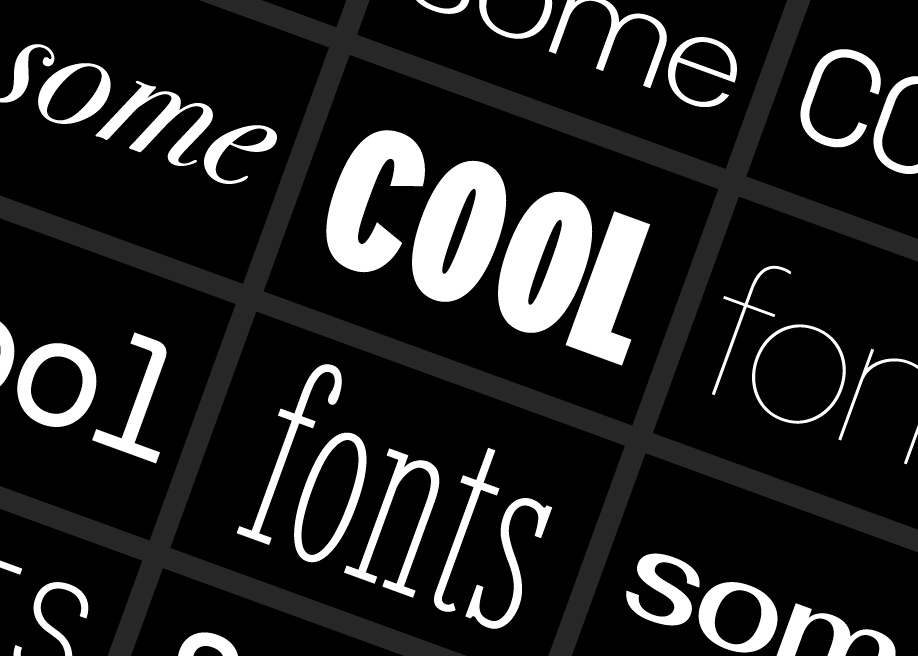
It is important to remember that different fonts have different effects on how your words look and feel. For example, a font with a thin line weight may give off a more formal vibe while a bolder font might help provide impact/guarantee readability. It’s not uncommon for professional designers to have around 5-6 fonts of choice so knowing these “types” of fonts would definitely come in handy.
You can view more about fonts here and see some great examples.
How do I choose?

For beginners, it’s usually best to stick with popular fonts such as Arial, Helvetica, Georgia, Verdana, and Trebuchet. These fonts are commonly used by both professionals and amateurs alike so it’s likely that your design will still come off looking presentable even if you use them.
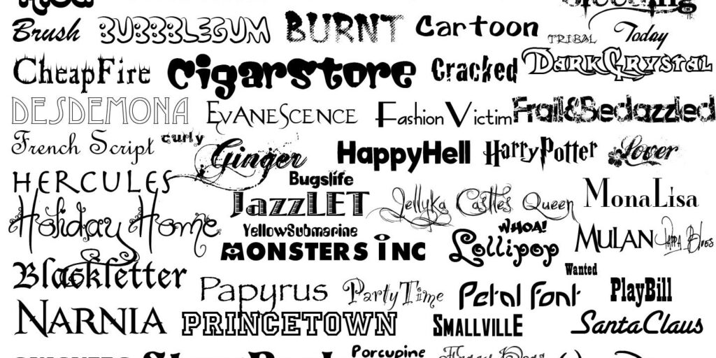
While it’s definitely tempting to use the newest and most unique fonts, designers argue that this often makes your design become unreadable or unprofessional. Do you really want people thinking that the pizza place down the street only uses Comic Sans for their menu?
How do you use them?
After deciding on a font, you would need to choose how to “use” it in your design. A common option is attempting to match the text color with its background color however this may end up creating overly contrasting images which can strain users eyes. Another common method is using different colors of text on top of the same colored background however
Do’s and Don’t Dos of Fonts
1. Use a unique and easy-to-read font

One of the most common issues in designing is choosing an appropriate and readable font and pairing it with another one to create contrast. An ideal font family consists only of two fonts: a sans serif for titles, especially headers, and a serif for body text – this combination is so common that you will see it everywhere in books, magazines or any printed piece.
If you want to add some spice to your design, why not try more than two fonts? Just keep in mind that if they don’t have much in common, they have to be from the same typeface family. Otherwise, your layout might look unprofessional. Use at least three different typefaces in a design – just don’t overdo it.
2. Beware of headlines in all caps!
When you’re setting a header, always use capital letters to make sure they stand out from the rest of the text. But don’t use ALL CAPS – these are really difficult to read! Google recommends using “sentence case” for headers or marking titles with an additional bold font weight. If you are not sure what this means, check the image below.
3. Don’t forget about the color

Remember that different have different effects on how your words look and feel. For example, a font with a thin line weight may give off a more formal vibe while a bolder font might help provide impact/guarantee readability. It’s not uncommon for professional designers to have around 5-6 fonts of choice so knowing these “types” of fonts would definitely come in handy!
4. Use similar letter spacing
When choosing two or more fonts, try to use the same amount of letter spacing for each one to avoid creating an uneven effect. If you don’t pay attention to this factor, you will end up with letters touching or huge gaps between them which can damage legibility.
5. Don’t just stick to one font, use different ones

Fonts are meant to be seen in action not just look pretty on the computer screen. This is why picking just two or three fonts for your design can be difficult since you will most likely want them to impress your audience. That’s where combinations come in handy! Just make sure that the combination fits together nicely and plays off each other.
6. Make it easy to read – don’t switch between serif/sans-serif too often
Serifs are characterized by small lines attached to strokes of letters while sans-serif has no extra features besides plain strokes. Most professionals recommend sticking with one style only when using body text because switching between both types.


