If you’ve never had to create a poster on your own, you’ve come to the correct place. To ensure that your next event is well attended by prospective clients, we’ve put up some simple strategies for making a poster stand out. Let’s start now.
How to Create a Poster?
A neat poster catches the eye. Start by making a list of all the information you will need to include on your poster template, including the event’s name, location, date, and time. You may want to add more, but keep it simple to avoid overstuffing your poster with images. Posters with too much text and/or imagery don’t function as effectively as those with less.
Consider announcing a two-week art exhibit at a neighborhood gallery. You don’t need to go into great detail when discussing a brief occurrence in order to make your point.
Stay away from adding things like artist biographies and thumbnails of their work. Here, the only objective is to draw attendees to your event. There will be several opportunities for you to inform them when they arrive.
Create Headlines That People Will Read

Your poster’s headline must grab viewers’ attention. They must stop and read the information you want to provide in addition to being drawn to it.
Even if you use a simple, descriptive term like “photography display” or “art exhibition,” it would be best to give a little more information. Try to succinctly describe your event so that attendees will know what to anticipate if they want to attend. Your title could be creative or simple, but it shouldn’t lead people astray or make them confused.
Create a Schema of the Visual Part
You must grasp visual hierarchy in order to create an effective poster. Information may be shown in a manner that makes sense for the design using a visual hierarchy. It determines the text’s size and placement. How the information is put together and how it flows will determine where your viewer’s attention will first go.
You already have all the data you need for your poster, including the particulars of the event. Ranking this data is the next step. A large image or icon will work if your poster design has minimal text. If the design is mostly composed of text, the text should take precedence. You’ll need a large header and substantial text for that design.
- The main parts of this text hierarchy (the rest of the text) are:
- The title,
- The subheading (a phrase or thought that supports or expands on the title),
- And the body text.
The most prominent element should be the headline, which should be followed by subheadings that are around the same size and the body content, which should be in the smallest font. There should only be one headline, but you are free to include as many body paragraphs or subheadings as you want. Keep things simple and give the eye plenty of room to rest.
Draw a Picture of Your Plan
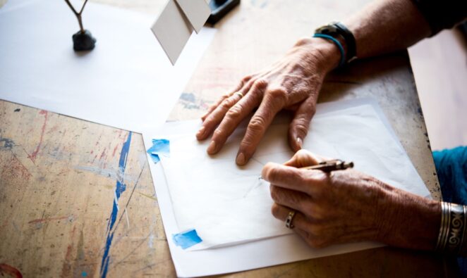
As an artist, you probably already know how important it is to make a complete rough draft before starting the final work. In the same way, creating your own poster is acceptable.
It’s time to design your poster’s layout after you’ve decided what details you want to include. Consider how you want to introduce your event to the attendees and what you want to say to capture their interest. Consider sketching down a few different concepts to see which ones are effective and which ones are not.
Need some inspiration? There are many imaginative poster designs out there that draw viewers in with dramatic black-and-white simplicity, inventive picture arrangement, and vintage aesthetics. For additional ideas on how to create a great poster, look at the winners of design competitions or stunning online design portfolios.
If you’re having difficulties deciding how to lay out your poster, you may download several poster templates to get you started. If you want to grab your audience’s attention, don’t be scared to experiment and violate the norms.
Decide on a Color Palette
The color scheme you choose can have a big effect on how your poster looks and how people see it. How your audience sees and reacts to your poster depends a lot on the colors you use.
It might be tempting to choose the brightest and most vivid colors you can if you want your poster to stand out. But not every poster design will benefit from vibrant colors, so consider what the poster is for. A billboard for a live band may look fantastic in black and white, while a banner for a vegan food store may appear better in more natural hues.
Examine Your Typography
You must include some writing in your poster design, regardless of whether it is based on a lot of text or a lot of photos.
This means that you have to choose the right fonts to go with the idea of your poster. A basic design may be made to stand out and create an impact by using smart typography. You can use the tips and suggestions here to choose the best font for your poster design.
Ensure That It Is Simple to Read
Can readers who are at a distance readily understand the poster’s primary text? Was it possible for a regular person to read the text without being confused by the font? It is crucial that the text on a poster used to advertise an event be easy to read.
Update Your Fonts
While you don’t have to stick with just one or two fonts for your whole poster design, you should make sure that the tone and aesthetic of each font complement your poster design idea.
Pay Attention to Context

Make use of typefaces that complement your design and the data you are displaying. Even if you prefer a certain font, it doesn’t always follow that it will look well on your poster.
For instance, you would choose a totally different choice of typefaces for a fundraiser for a medical cause than you would for a heavy metal band’s event poster.
It’s time to start creating posters now that you know how to make effective ones that grab attention. Let’s hope the outstanding poster you created helps your project sell out!


